User-favorite website analytics tool
Copyfolio is a website builder created for writers and marketers – and Site Insights was created specifically for them, built directly into the product. My task in this project was to make it easy for users to see who visits their site and what pages they view. Initially, the plan was to integrate Google Analytics, but we ended up deciding to build our own, simplified version instead.
Reading time: 4 mins
Team
1 designer & 1 developer
My role
I’ve been working as the sole designer on Copyfolio’s small team since February 2023 – which made it tough to choose just one or two projects to write a case study about. During this time, I’ve redesigned the blog feature from the ground up, designed features for a new target group, made countless usability improvements, shaped the product to support a completely new strategy, and recently started revamping our monetization strategy, and so on.
I chose the analytics feature because it captures a lot of what I’ve learned here: user-first design, product strategy, big-picture thinking, and close collaboration with developers.
Project scope
When I started working on this project, I assumed that users, especially marketers, would prefer using Google Analytics for their site, since they were familiar with it and used it day to day. But research showed that most of them only used it out of necessity, and even then, they relied on just a small percentage of its features. So I approached my product lead, and we agreed that it would be best to build a built-in analytics tool instead.
Challenge
Most of Copyfolio’s users are not tech-savvy. They usually face a bigger learning curve with digital products and tend to prefer limited over complex tools. This is true for Copyfolio as a website builder too – and it’s one of our biggest advantages over competitors. So I had to make sure Site Insights followed the same principle: keeping everything extremely simple and user-friendly, even for users who had never built a website before.
Outcome
Site Insights was released in September 2023, and to this day, it remains one of our users’ favorite features. It’s used by over 2,000 of them, frequently mentioned during user interviews as a reason they love Copyfolio, and contributes 8% to total conversions.
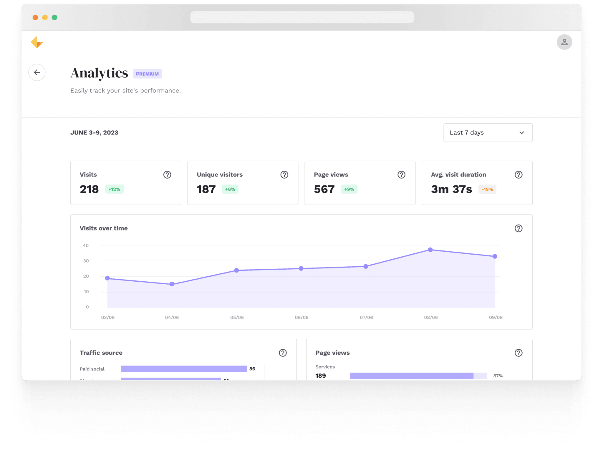
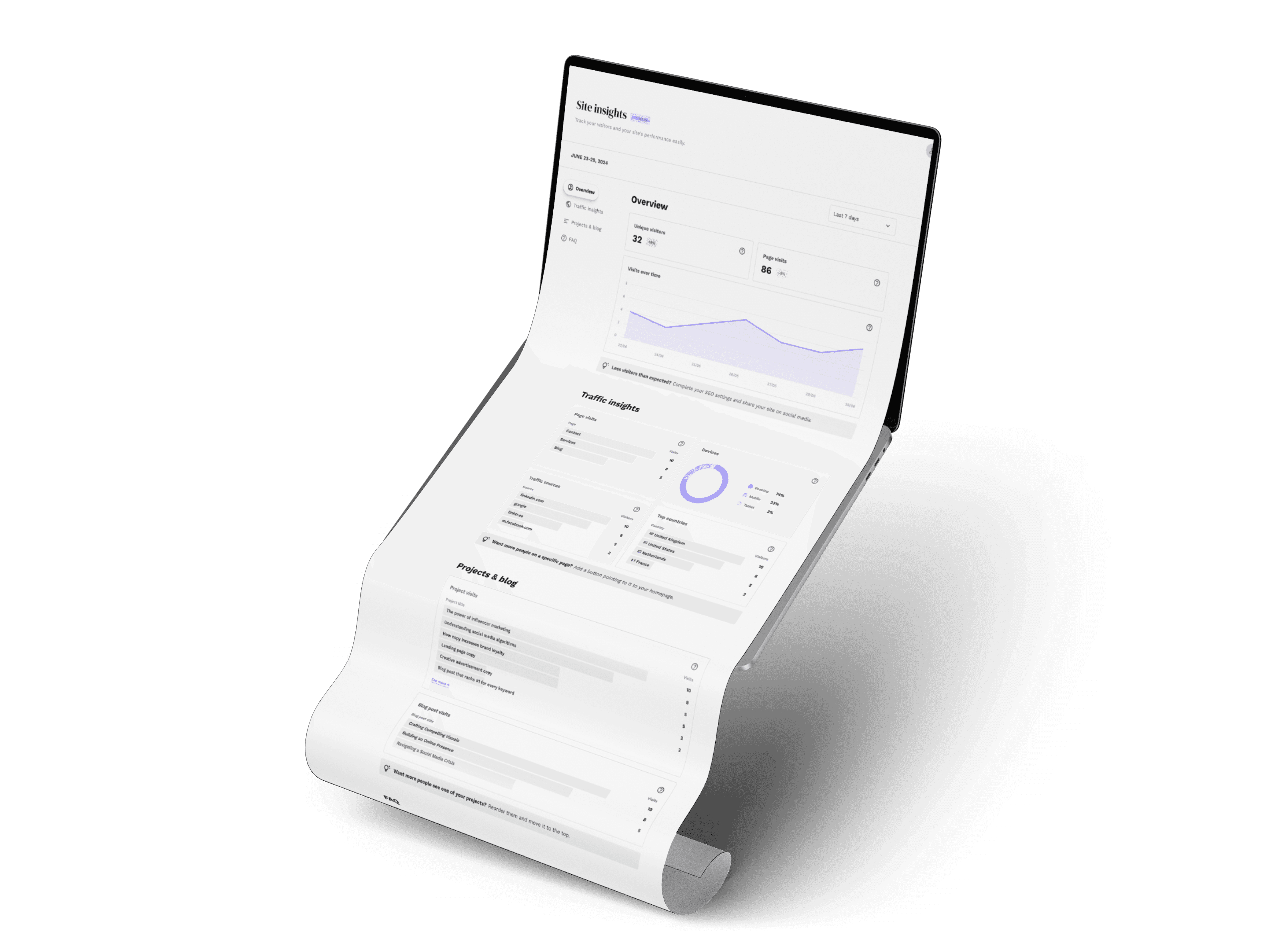
First screens
First, I carried out competitor and desk research. I collaborated closely with our developer to make sure that everything I designed was technically feasible. Once the initial screens were ready, I tested those with Copyfolio users. While everything passed, I felt the design was still too dashboard-like, hard to scan, and somehow lacking that "Copyfolio feeling", so I got to work.


Small details
With this feature, I felt the secret sauce was in the small details – interactions, helper texts, tips, and how the information was presented. I began iterating on the UI: I swapped out the purple for neutral colors so the headings would draw the eye first. Next, I added anchor points to create clear groupings on the page instead of one bigger bento layout.
With help from our copywriter, I included tips at the bottom of each group, giving users actionable insights on what to do with the numbers. These tips are randomized every time the page is refreshed. Finally, working with our developer, we added subtle interactions and loading animations.

Final screens
I added a time frame selector with the most commonly used presets, and at that point, the feature was mostly ready to go – except for the name, which was still undecided. We chose the name “Site Insights” after research revealed that calling it “Analytics” caused some confusion with Google Analytics. We wanted to make it very clear that this was a built-in tool.
There were quite a few edge cases to cover: when there’s no data available, when the user doesn’t have any projects or blog posts, when their blog posts are still drafts, and how the feature looks for free users, as we didn't want to hide it.

+1: Free users
We wanted this feature to possibly be a conversion point for free users, so it was important to give them a real preview of what they’d be paying for. To achieve this, I designed the page in a way that creates a subtle sense of missing out on a feature – making users consider upgrading without being too intrusive.
Learnings
I learned quite a bit during these few weeks, about data visualization or what's feasible within the stack we're working with, but my biggest learning during this project was that even if the scope is already decided, if that doesn't align completely with the user needs, take a step back and try to look at the big picture instead.